
When I manually run a water cycle, I need to know how long it's running for, so that I can turn it off if I need to.
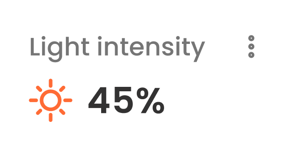
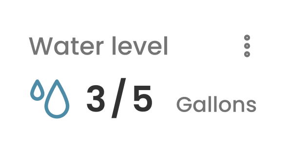
Gardyn home screen
Redesigning widgets for more accessible controls.

Context: Gardyn is an indoor hydroponic system that helps users grow healthy plants at home for food or decoration. The app enables users to schedule the light and watering needs for their garden to thrive.
TLDR
Gardyn's app widgets enable users to control their light and watering schedules, but the functionality was a bit cumbersome. Scheduling errors were higher than expected, which prevented people's plants from thriving.
I simplified the visual and interaction design of the widgets and brought the designs up to WCAG standards. This redesign resulted in a 5.7% reduction in customer support tickets and a 43% decrease in accidental schedule changes.
The main problem
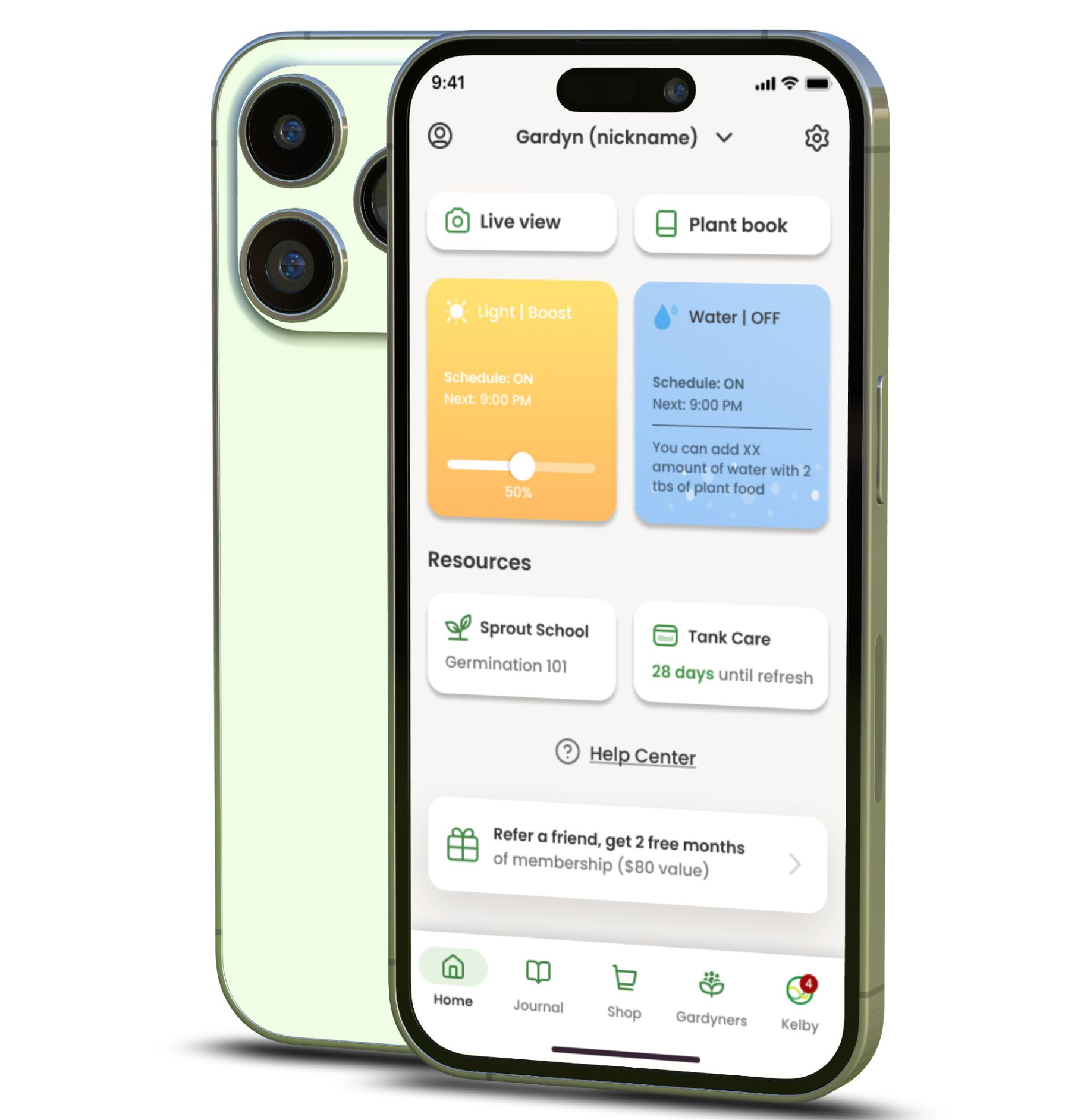
Users were seeing their plants start to die—this was obviously not great. We interviewed our users and found that our widgets, while providing full control, didn't communicate the downstream effects that alterations to the schedule might have on their garden. People were also confused about how changes on the widget impacted scheduling versus being a temporary adjustment.
What people needed
After conducting interviews, we identified some core tasks we missed on delivering to our users.
Jobs to be done
When I manually dim my light, I expect it to be temporary and affect my schedule.
When I am watching TV near my garden, I want to dim the light so that the light intensity doesn't impact my viewing experience.
Some room for improvement
We needed some adjustments to make our widgets simpler, clearer, and brought up to WCAG standards.
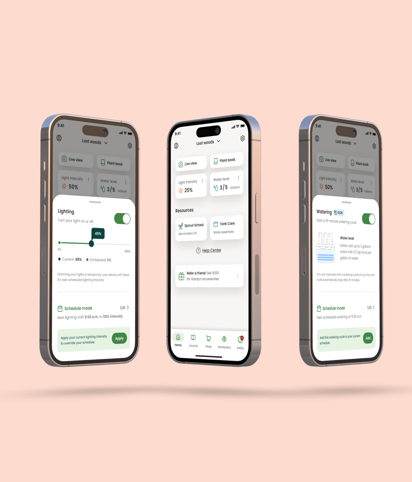
Redesigned widget experience
While simplifying the widget, we removed the functionality from the widgets themselves and made them only display the current status. This let us give the controls the space they required to remain comprehensive. Putting these controls in a bottom sheet kept the users grounded on their location in the app while giving it a consistent and dedicated place to look to make changes.
Controls exploration
The final designs
We prototyped and tested a few options with users to see which of our designs was most clear, and there was one that stood out amongst the rest. Along with the visual and IA overhaul, we partnered with the engineers to ensure any changes would temporarily override the schedule rather than altering it—this better aligned with people's expectations.
Adjustments
Overlapping touch targets: separated the slider and on/off switch.
Improved information architecture: improved information hierarchy, and provided users additional context for their actions and their repercussions.
Functionality: after changing the widget inputs to be temporary, we gave users the ability to push their adjustments to their schedule.
ADA guidelines: we ensured all type sizes and contrast ratios complied with ADA standards.
Results:
Fewer tickets and fewer dead plants. Clearer hierarchy, accessible type and color, and a dedicated sheet for edits reduced confusion between temporary tweaks and the real schedule—support saw less noise and users stopped fighting their own defaults.
5.7%
Reduction in customer support tickets after launch.
43%
Decrease in accidental schedule changes.