
Users wanted to track their progress to be reassured of the product's effectiveness.
Cove Relaxation Index
Improving the Cove app through data visualization and providing users meaningful session feedback along their journey.

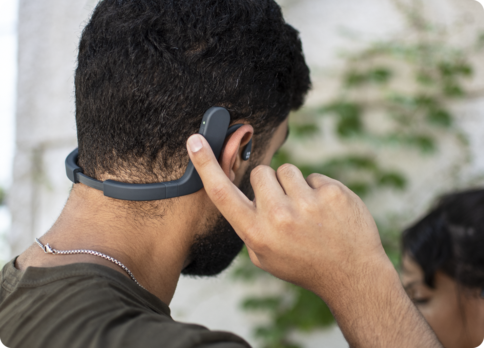
Context: Cove is a physical device that uses patented vibrations to mimic affective touch therapy for 20 minute sessions. This helps people to fall asleep faster, feel more rested, and become mentally resilient to the stresses of life.
TLDR
The average time it takes for people to feel a tangible benefit with the device is about 20 sessions. However, due to the delay in perceived benefit, we observed people stop using Cove and return it. In order to better communicate the progress people
were making, we visualized biometric data and notified them of their improvement each session. This resulted in a 300% increase in people who viewed their progress, which contributed to a 10% decreased in returns.
Why were people returning their Cove?
We spoke to our customers, diving into their needs, wants, and expectations, to find out where we missed the mark.
We accomplished this by sending out 250 surveys and sorting through 175 responses.
Trends we spotted
Users were seeking guidance to ensure they were using the product the right way.
Users mistakenly believed that the device should be used while sleeping.
Prioritizing the problems
I knew we could reduce returns by addressing the first two issues and worked with marketing to refine the third. We decided to focus on creating data-viz for users to show them how they were making progress.
I partnered with engineering and data science to understand what technical constraints & data we had, then shortly after, kicked off visual explorations.
We had our starting point
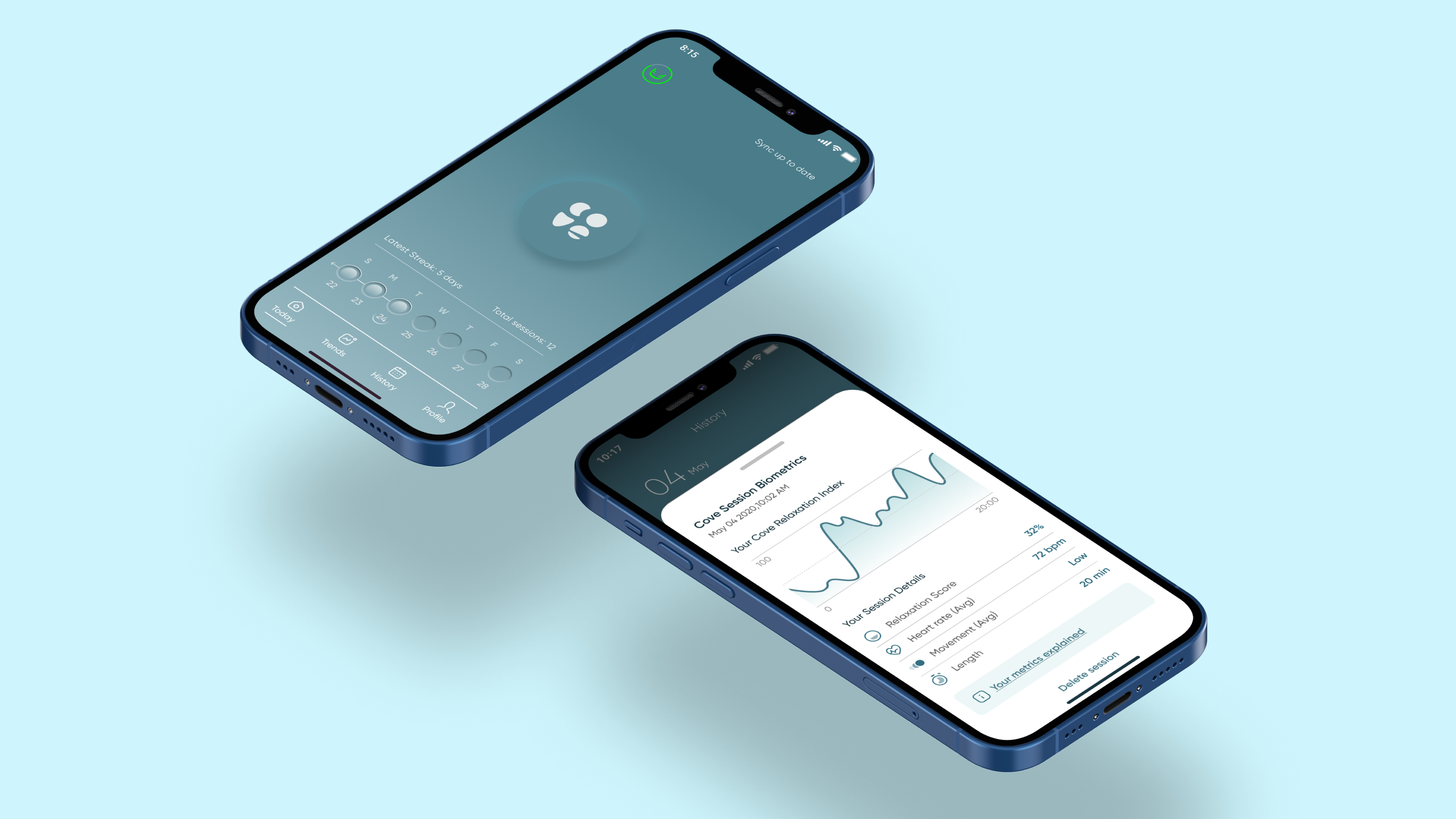
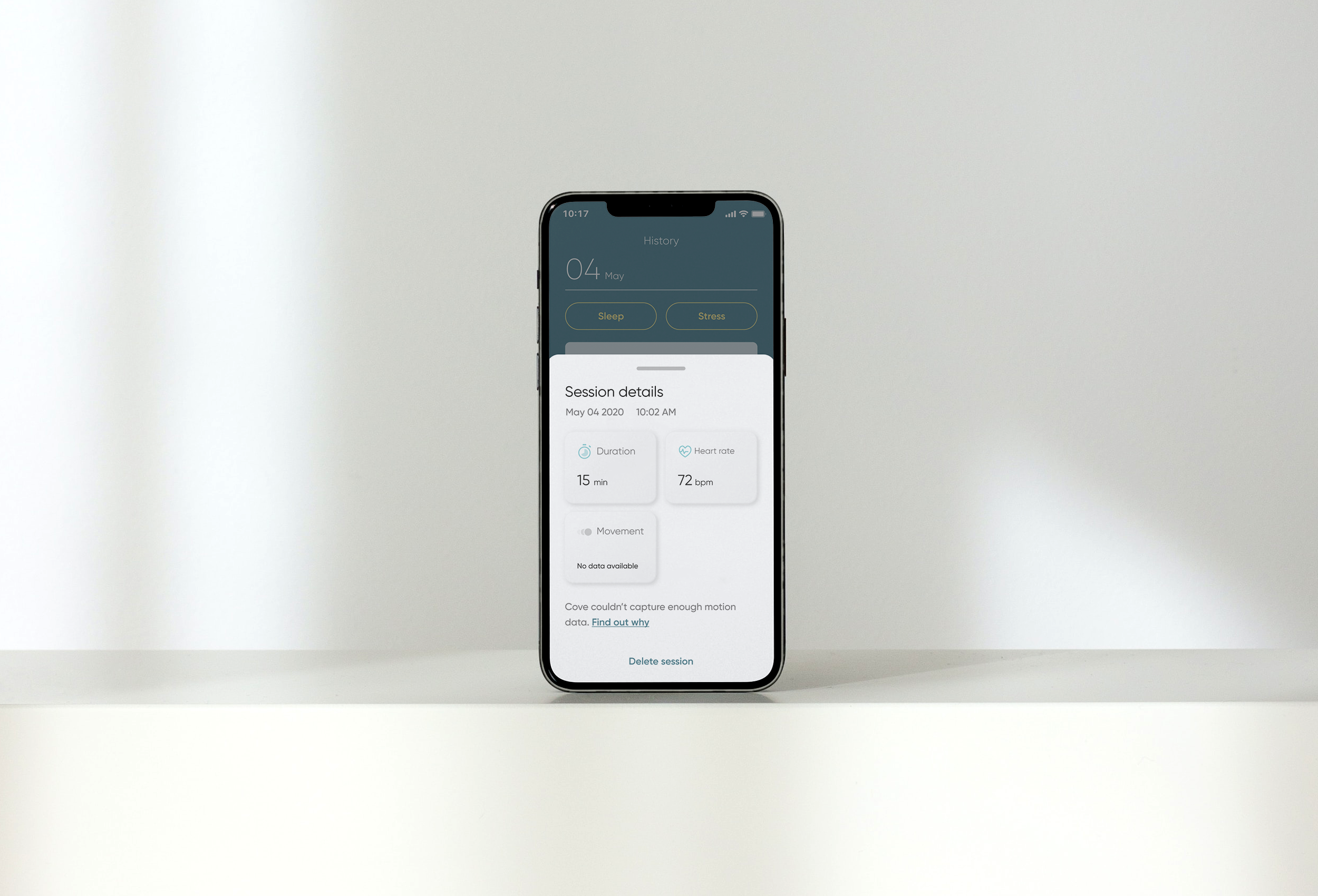
Cove already had a feature called "Session Details," which utilized raw data available from the backend to present it to consumers. It displayed a sessions duration, as well as the users' average heart rate and movement during the session.
At face value this doesn't say a lot, but when put together it can tell users everything they need to know - leading us to our solution.
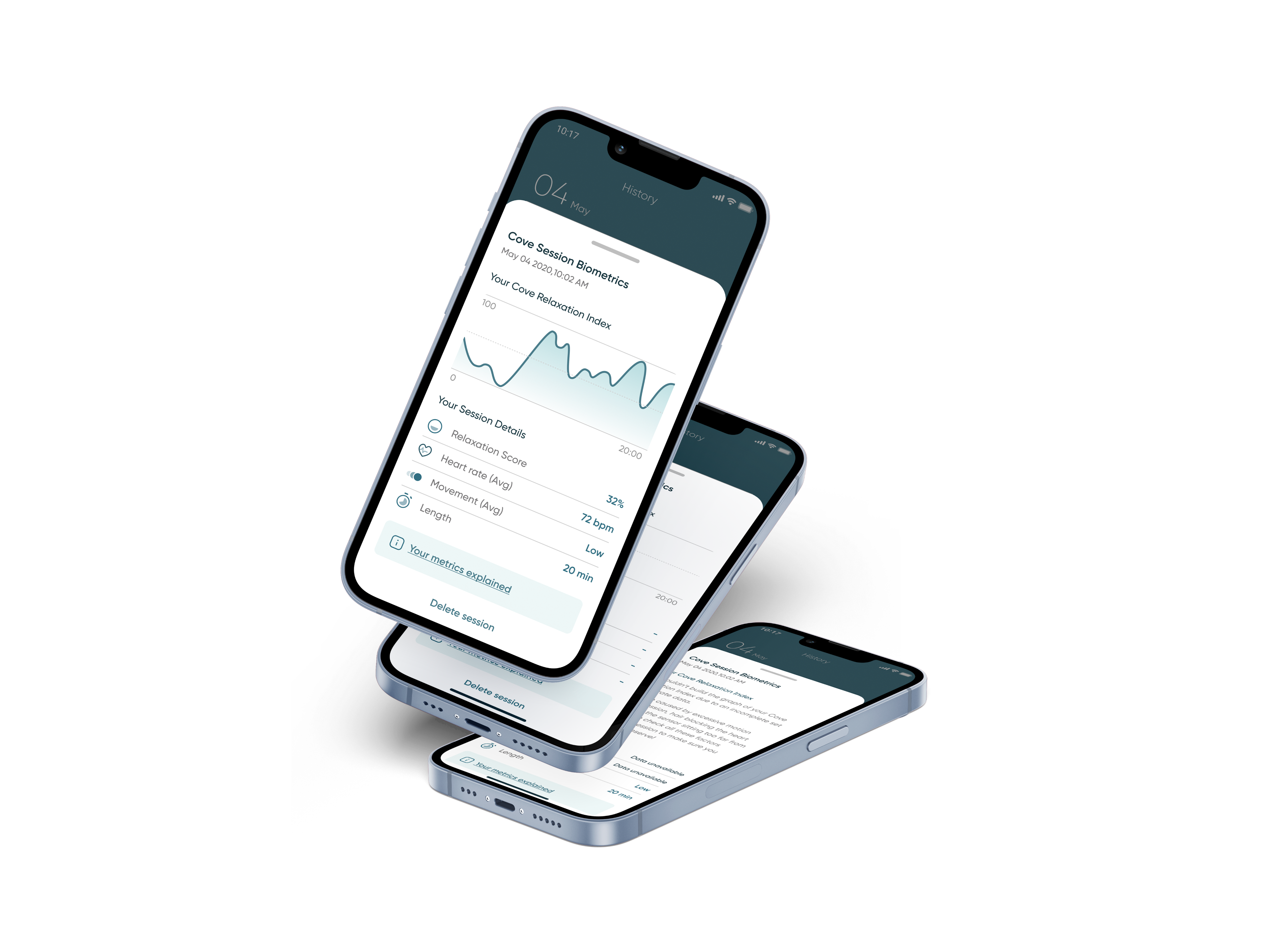
A data-driven peace of mind; visualizing user progress, session by session
Building off of Cove's session details, our solution was clear: create visualizations based off of the biometric data that users were already familiar with.
We created an algorithm that took users recorded heart rate and micro movements over the course of their 20min session to calculate their stress and to quantify their level of relaxation. We then plotted these calculations onto a graph, highlighting when during their session they were most relaxed. We called this graph the "Cove Relaxation Index".
Figuring out how this might look
Not everything that shines is gold
After some explorations and stakeholder alignment, we took our top options to our users for testing.
The result? Users wanted more detailed information from our design.
Taking the feedback, we made some vital changes
Users wanted more granularity in the data. This inspired the creation of the "Relaxation Score," which averaged the users relaxation index across their entire session.
We added a few more final touches, improved our information hierarchy, and cleaned up the visuals before launching the final product.
Results
We launched, and found success. We leaned heavily on the invaluable research and cooperation of our users throughout this process, and it payed off. They provided the missing puzzle pieces that helped us find success in this initiative.
2x
visits to session details
1.8x
average weekly session count
20%
decrease in returns